Flexbox is a powerful CSS feature that allows you to easily and efficiently manage the layout of your website. It makes it easy to create responsive designs, or even integrate dynamic resizing if you want. Flexbox is one of the most powerful CSS features for layout. It makes it easy to align elements, resize them appropriately and adapt to different screen sizes.
Contents
Why FlexBox
Flexible boxes, or Flexbox, is a new layout mode in CSS3.The Flexible Box Layout Module, makes it easier to design flexible responsive layout structure without using float or positioning. Use of Flexbox ensures that elements behave predictably when the page layout must accommodate different screen sizes and different display devices
It allows you to control the layout in a parent container. It offers some useful settings, which allow you to control the alignment of the items and to distribute the extra space. Flexbox is one-dimensional. That means it lays out its items in one dimension – either horizontally or vertically.
Benefits of CSS3 FlexBox
- For many applications, the flexible box model provides an improvement over the block model in that it does not use floats
- A “new” way of looking at responsive layouts
- Makes “mobile first” layouts a breeze
- page content can be laid out in any direction (to the left, to the right, downwards or even upwards)
- bits of content can have their visual order reversed or rearranged
- items can “flex” their sizes to respond to the available space and can be aligned
- with respect to their container or each other
- offer space distribution between items in an interface and powerful alignment capabilities
Basic Components and Terminologies
The CSS Flexbox specification describes a layout with items (flex-items) inside a container (flex-container). These items can grow or shrink in width and/or height, according to the available container space. The items “flex” to fit the parent container in the best possible way.
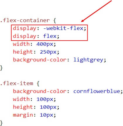
A flex container is declared by setting the display property of an element to either flex (rendered as a block) or inline-flex (rendered as inline). Inside a flex container there is one or more flex items.
Everything outside a flex container and inside a flex items is rendered as usual.
Flex items are positioned inside a flex container along a flex line.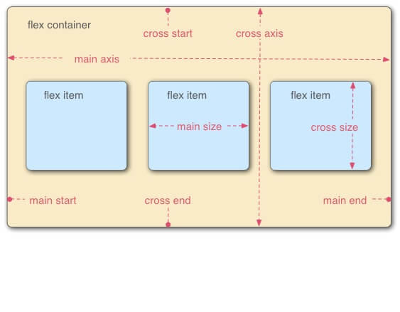 To make an element a flex-container, set its display property to flex.
Display: flex
Example
HTML code
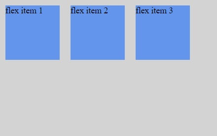
Result
Flex Direction Property
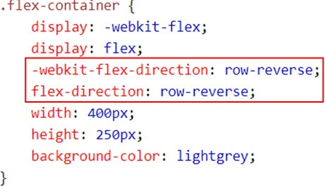
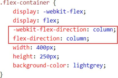
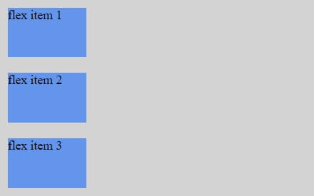
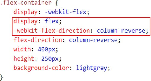
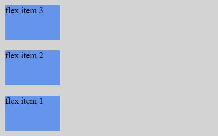
You can control the flow direction of flex items by defining flex-direction. This is done on the container level, not the item level.
- row (default, horizontal, from left to right)
- row-reverse (horizontal, from right to left)
- column (vertical, from top to bottom)
- column-reverse (vertical, from bottom to up)
When we did not specify flex-direction, it used the default value, which is row. For horizontal placement, but from the other direction, you can use row-reverse. For vertical, you can use either column or column-reverse.
Example (Row-reverse)
Result
Example (Column)
Result
Example (Column-Reverse)
Result
Justify content (Horizontal Alignment property)
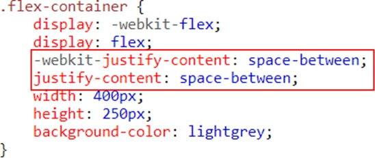
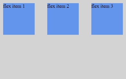
The justify-content property can be used not only for aligning items, but also for spreading items evenly across all the available space on the main axis.
The possible values are as follows:
Flex-start – Default value. Items are positioned at the beginning of the container
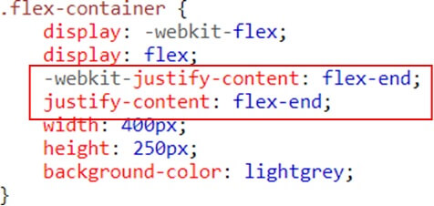
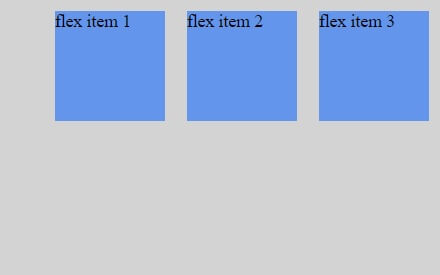
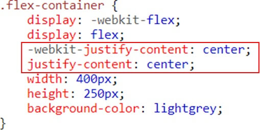
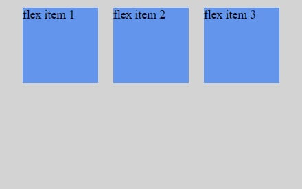
Flex-end – Items are positioned at the end of the container center – Items are positioned at the center of the container
Space-between – Items are positioned with space between the lines
Space-around – Items are positioned with space before, between, and after the lines
Example (Flex-end)
Result
Example (Flex-center)
Result
Example (space-between)
Result
Align Items Property (Vertical Alignment)
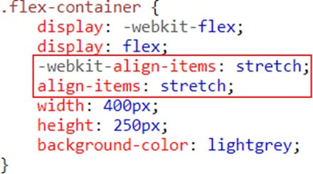
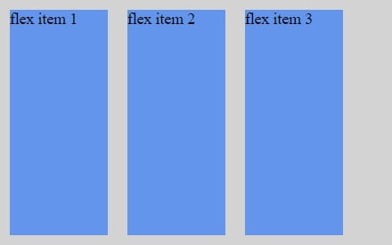
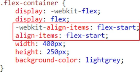
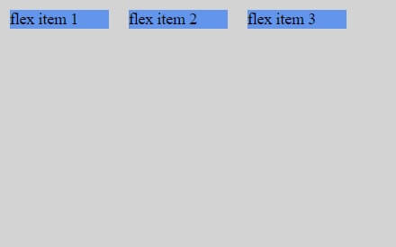
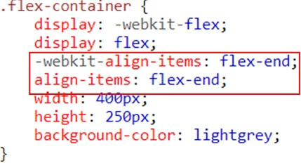
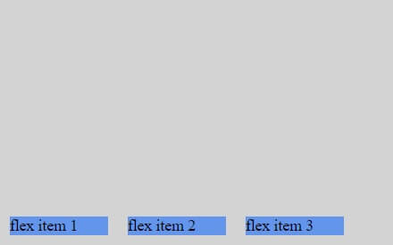
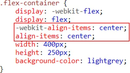
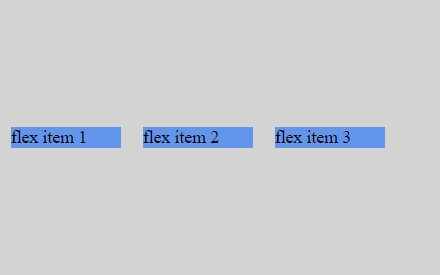
The align-items property vertically aligns the flexible container’s items when the items do not use all available space on the cross-axis
The possible values are as follows:
Stretch – Default value. Items are stretched to fit the container
Flex-start – Items are positioned at the top of the container
Flex-end – Items are positioned at the bottom of the container
Center – Items are positioned at the center of the container (vertically)
Baseline – Items are positioned at the baseline of the container
Example (stretch)
Result
Example(Flex-start)
Result
Example(Flex-end)
Result
Example (center)
Result
Flex-wrap property
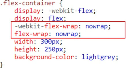
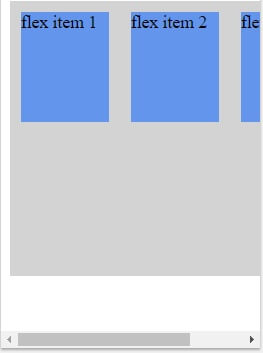
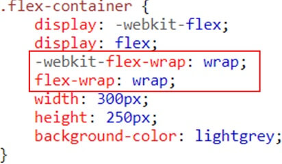
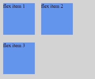
The flex-wrap property specifies whether the flex items should wrap or not, if there is not enough room for them on one flex line
The possible values are as follows:
No wrap – Default value. The flexible items will not wrap wrap – The flexible items will wrap if necessary
Wrap-reverse – The flexible items will wrap, if necessary, in reverse order
Example (no wrap)
Result
Example (wrap)
Result
Flex item properties-Ordering
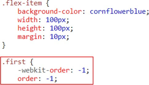
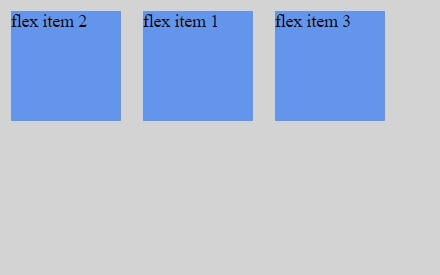
The order property specifies the order of a flexible item relative to the rest of the flexible items inside the same container
Example (ordering)
Result
Flex item Properties-Margin
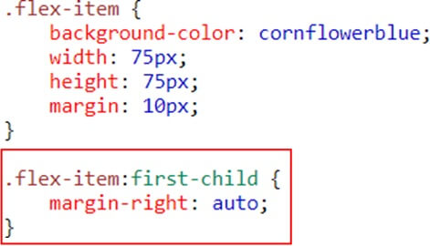
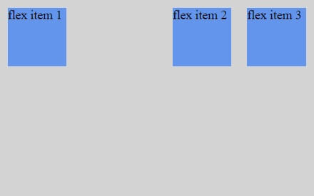
Setting margin: auto; will absorb extra space it can be used to push flex items into different positions.
Example
Result
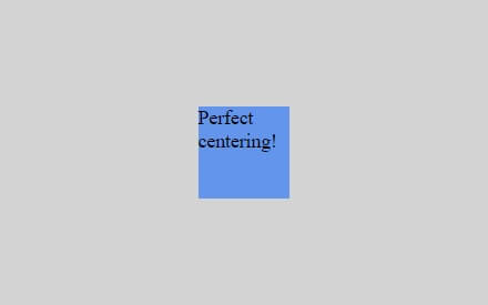
Setting margin: auto; will make the item perfectly centered in both axis
Result
Flex item property- Flex
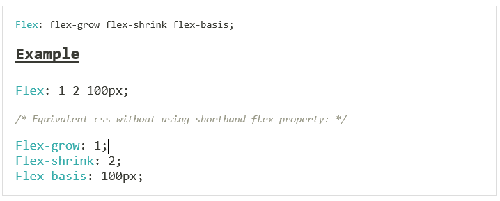
The flex property specifies the length of the flex item, relative to the rest of the flex items inside the same container
CSS3 Flexbox Properties (Summary)
- Display- Specifies the type of box used for an HTML element
- Flex-direction- Specifies the direction of the flexible items inside a flex container
- Justify-content- Horizontally aligns the flex items when the items do not use all available space on the main-axis
- Align-items- Vertically aligns the flex items when the items do not use all available space on the cross-axis
- Flex-wrap- Specifies whether the flex items should wrap or not, if there is not enough room for them on one flex line
- Align-content- Modifies the behavior of the flex-wrap property. It is similar to align-items, but instead of aligning flex items, it aligns flex lines
- Flex-flow- A shorthand property for flex-direction and flex-wrap
- Order- Specifies the order of a flexible item relative to the rest of the flex items inside the same container
- Align-self- Used on flex items. Overrides the container’s align-items property
- Flex- Specifies the length of a flex item, relative to the rest of the flex items inside the same container
Conclusion:
Flexbox is a powerful CSS layout method that makes responsive development easier. It’s easy to understand and use, especially once you’ve used it a few times. It’s perfect for any situation where you need to make elements more flexible, reorder elements, or create a responsive layout.
While working with Flexbox, it’s important to remember that you aren’t creating a layout from scratch. Instead, you are creating a layout from a single element. All the other elements will be resized and reordered around that central element.
If you are looking to create a responsive layout, or you have lots of content on a page, then it’s a good idea to use Flexbox. It will make your layout easier to create and it will resize as the screen size changes. For more information please consult with Andolasoft.

